


Designer lobby (first screen)

Designer portfolio (second screen)
Research
Finding the right approch
I iterated extensively on the generation prompt itself, trying different structures, instructions, and constraints to push the visual output further. Some things moved the needle slightly, most didn't. What kept coming back as the only approach that actually produced results was giving the AI a reference image to work with. That insight became the foundation of everything that followed. We knew this approach wasn't built for scale, but the race was real and we took that tradeoff.
Designer lobby (first screen)
Designer portfolio (second screen)
Step 1
Creating a prompt that generates a good brandbook
I developed a specialized prompt that translated a visual reference image into a structured brand book: a comprehensive JSON covering color roles, typography, grid layouts, and more. Getting this right took serious iteration, testing every major engine, defining color roles, teaching the prompt to extract brand from an image and ignore its literal content. Once it worked reliably, we had the foundation to build on.
Takeaways
1. Optimizing one step can quietly damage the ones that follow.
It's tempting to push for maximum engagement with any single feature. But in an onboarding funnel, every step exists in context. The real measure of success here wasn't designer selection rate — it was whether users went on to generate, publish, and upgrade. We kept that lens on every decision, including the ones that led us to drop the mandatory-step concept entirely.
2. Simpler visuals communicate more.
The more specific the imagery, the more it narrowed users' expectations — and the more confused they became. Pulling back to mood-based thumbnails gave users just enough to make a confident call without over-promising a specific output. Less really was more, and the data confirmed it.
Previous version
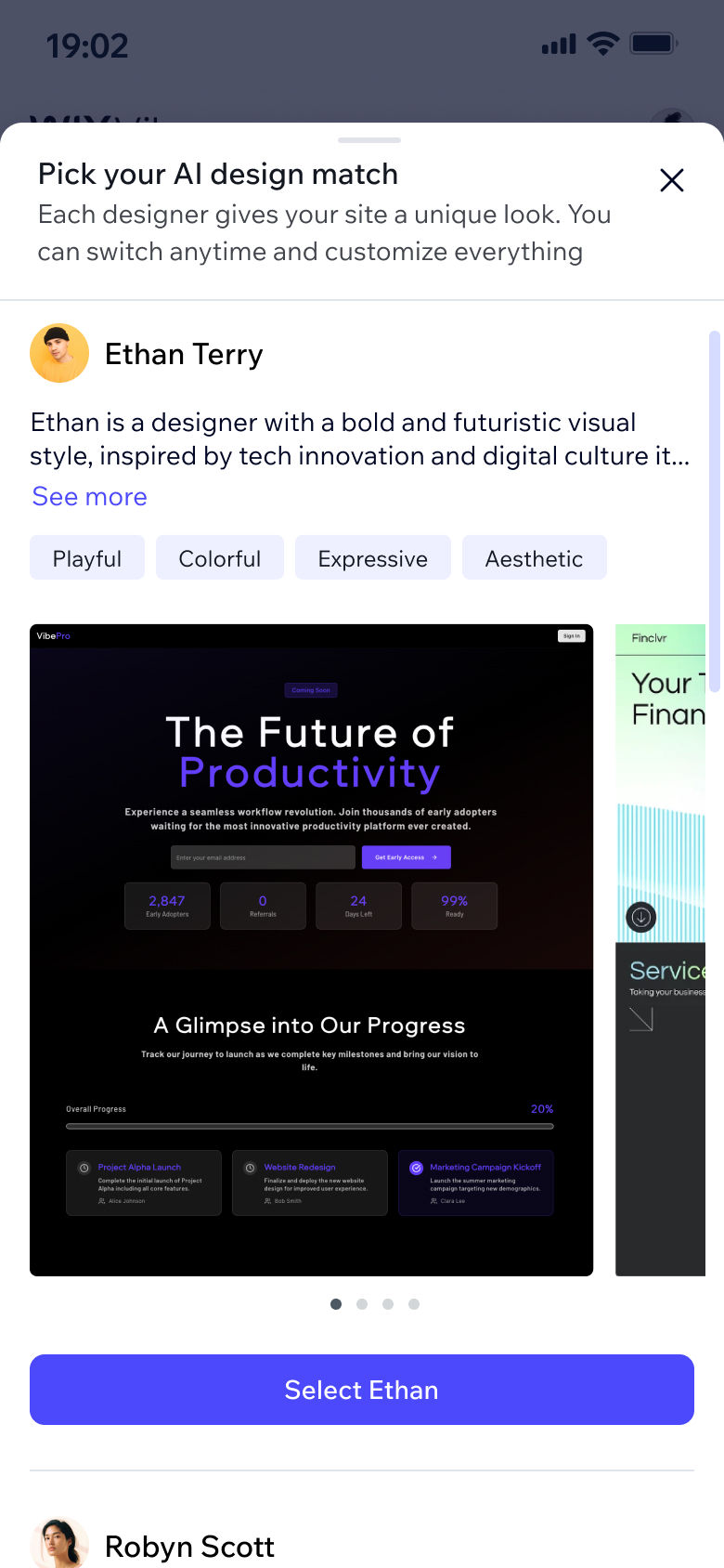
Designer lobby (new)

Designer portfolio (new)

Designer lobby (first screen)
Designer portfolio (second screen)
Approach
Create a large database of brand-books based on reference images for the AI to work with as inspiration when generating a user site.
Giving the AI both a reference image and a pre-made brand book based on that image gives it a stronger design starting point without spiking generation time.
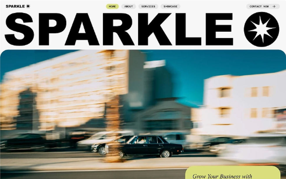
Some of the reference images behind the brand books



The previous mobile version required scrolling in two directions just to see all options creating a serious usability issue. This structure respects two different personas: the ones who want to choose fast, and the ones who want to really explore, without forcing either group into the other's experience.
Full flow in context, new design
Step 2
Categorizing the brandbooks to distinctive styles
In order to organize the brand books, we defined five visual styles based on research with our visual content experts and data from existing Wix templates. Each style was matched with a user-facing Designer Persona for users to choose from during onboarding (read about that here). Every brand book was then assigned to one of the five styles.
From there, I curated 100+ reference images from Wix's existing assets, ran each through the brand book prompt, reviewed every output, and organized them across the five styles. The goal wasn't just quantity. It was making sure every style had enough depth and variety that users wouldn't see repetitive output.
The end result was a database of ~100 brand-books that were categorized into five visual styles.
The process of creating a brand book-
Reference image

Step 1
Run reference image through brand book maker prompt
Brand book created

Step 2
Design DNA extracted into JSON
Assigned to designer

Step 3
Added to the database

The visual styles & personas presented to the end user
The logic
Creating a matchmaking prompt
Connecting user prompts to the right brand book required its own dedicated prompt. The tricky part: some users include specific design requests ("a black and white site for my car dealership") and some don't. The system needed to handle both without spiking generation time.
No design request:
The AI matches a brand book to the user's prompt according to the site intent, industry, and chosen Designer Persona (if the user chose one).
Specific design request:
The AI generates a custom brand book on the fly rather than scanning the whole database, which is faster and can guarantee to give the users exactly what they asked for.
Getting the prompt to understand what actually counts as a design request took a lot of back and forth. "A pretty modern site" doesn't count. "A red site" does.
The tradeoff:
On-the-fly custom brand books weren't always as high quality as the database ones, but we anticipated that going in and took it consciously.
Site generation logic

The generated site shown is from a brand book in the database. This is a real user site.
Step 4
Quality testing
I generated countless sites with Wix Vibe using the new database and reviewed the output. Some failed, some needed tweaking, most passed. The standard was simple: would this site make someone stay? Testing was ongoing and kept surfacing new issues, often impacting overall generation time which was a non negotiable. Once we got it right on all accounts, we integrated the matchmaking prompt and the brand book database into the main generation pipeline and sat back to see our users create beautiful AI generated websites.
Other projects


Results
From obviously AI-made to genuinely designed websites
Each brand book paired with a user prompt produces a unique result, and interestingly, even if you use the same brand book with the exact same prompt twice, you'll get a different site each time. This is what gave the database its real power: not just a fixed set of outputs, but an almost infinite range of design possibilities built on a curated foundation.
User prompt: "A blog that reviews films and pop"
Takeaways
1. Optimizing one step can quietly damage the ones that follow.
It's tempting to push for maximum engagement with any single feature. But in an onboarding funnel, every step exists in context. The real measure of success here wasn't designer selection rate — it was whether users went on to generate, publish, and upgrade. We kept that lens on every decision, including the ones that led us to drop the mandatory-step concept entirely.
2. Simpler visuals communicate more.
The more specific the imagery, the more it narrowed users' expectations — and the more confused they became. Pulling back to mood-based thumbnails gave users just enough to make a confident call without over-promising a specific output. Less really was more, and the data confirmed it.
Before:

After (with database):

Impact
The redesign did indeed move both KPIs we set out to improve.
The brand book database gave Wix Vibe a clear quality edge over competitors at the time. More importantly, it gave the product something to be proud of: output that could genuinely convert a skeptical user into a paying one.
+8%
more users published their site after the first generation
-21%
fewer design-related prompts sent after the first generation
We were satisfied with the results and knew this was only the beginning. The first goal was to win a design advantage over our competitors, and we did. The next step is to get the AI there without relying on a static database that requires ongoing maintenance. We saw this project as a stepping stone: a way to learn how to best work with the AI, so that once the engines mature enough, we can enhance the system prompt to a point where the database is no longer needed.
User prompt: "A fitness studio site"
Takeaways
1. Optimizing one step can quietly damage the ones that follow.
It's tempting to push for maximum engagement with any single feature. But in an onboarding funnel, every step exists in context. The real measure of success here wasn't designer selection rate — it was whether users went on to generate, publish, and upgrade. We kept that lens on every decision, including the ones that led us to drop the mandatory-step concept entirely.
2. Simpler visuals communicate more.
The more specific the imagery, the more it narrowed users' expectations — and the more confused they became. Pulling back to mood-based thumbnails gave users just enough to make a confident call without over-promising a specific output. Less really was more, and the data confirmed it.
Competitor

Wix Vibe

Takeaways
2. Training a model is a design problem.
Too much structure and the results feel generic. Too much freedom and they fall apart. Finding the range where output feels both creative and professional took constant iteration — and that iteration never really ends.
3. Influencing a company takes longer than shipping a feature.
We set out to establish a reusable AI design pattern across Wix products — and it happened, just not on sprint timelines. Teams behind Wix Vibe, Base44, and Wix Nano all adopted a similar model.
Note that the users are free to do any manual iterations after their AI result, not all results here are one-shot
Real user sites generated on Wix Vibe using the brand book database


Overview
Beautifying AI powered websites
How I built a database and logic that made AI-generated sites look like a designer made them.
Wix Vibe wanted to stand out in a crowded AI builder market, and quality was one of the ways to do it. At the time, every AI builder out there was generating sites that looked ok at best. If we could do dramatically better, generate sites that looked designed by a designer, users would stay. I was brought in to make that happen.
Role
Lead Product designer
Platforms
Prompt Hub
Year
2025
Contributions
Prompt Engineering, Content Strategy, Visual Curation, Quality Testing

Problem
How do we get AI to make beautiful designs?
The bar we set was high: a user types a single prompt and gets a site that genuinely feels like a designer made it. The problem was that the major AI engines at the time, GPT, Claude, Gemini, simply weren't capable of delivering that. No matter how we framed the prompt or how many times we iterated on it, the visual output fell short. The engines weren't there yet, and waiting for them wasn't an option. We needed a different approach and we needed it yesterday.
Designer lobby (first screen)
Designer portfolio (second screen)
Current state
Wix Vibe generates generic and boring sites
User prompt: "Nail salon site"

Example of the current state (boring and generic websites)
Color combinations felt dated, layouts were boring, and it was immediately obvious the output came from a machine rather than a designer. The sites were not good enough. Our standard was sites that felt professionally designed, and we were far from it.