
Overview
How I redesigned a multi-location ordering experience with an approach no competitor had tried.
Wix Restaurant Orders is an online ordering app for food businesses on Wix. When we rebuilt the app, multi-location support was the most requested missing feature - and migrating an existing user base from the legacy app meant any change to the ordering flow had to be handled carefully. That constraint became the lens for every design decision.
One thing worth noting: Wix is a DIY platform, which means every screen I designed functions as a skeleton - the layout, interactions, and logic are mine, but each business owner customizes the visual style to match their own site. The design had to work across all different design aesthetics.
Contributions
UI/UX , Product Strategy
Year
2024
Role
Lead Product Designer
Platform
Desktop, mobile & Wix editor

Challenge
Design a feature for new and legacy users
We had a large user base on the legacy app waiting to be migrated. The data made the priority clear:
6%
of legacy app users had multiple locations
9%
of total sales income came from multi-location sites
8%
of the app's top users were multi-location businesses
Migrating the users to the new app came with a challenge : A dramatic change in the UX risked churning the very users we were trying to bring over. On the other hand, we saw this as an opportunity to improve the feature and meet the needs of all of our users, both legacy and new.
Current state
Selecting a location in the legacy app
"Menu first" approach (legacy app)

The old app used a "menu first" approach: customers could browse a menu before committing to a location, but couldn't view the full item details or add to cart without selecting a location. They are viewing sort of a demo menu which is replaced with a correct menu once a location is selected. A location picker only appears once a site visitor clicks on an item or on the the "Choose how to get your order" banner.
Research
"Location first" VS "Menu first" approach
Our research was anchored around one central question: how far into the ordering journey should a customer get before being asked which location they're ordering from? This question is crucial since the user may be ordering from a different location than the menu they are currently viewing: each location may have different offerings or delivery times. It could also be that the location is completely irrelevant to the user since it doesn't deliver to their address. In other words, the UX here acts as a protector and we need to handle it with care not to cause frustration.
Competitor analysis
Every direct competitor we looked at, used a "location first" approach: customers must select a location before browsing the menu. This is a non-dismissible action, a quite aggressive approach. Clean and unambiguous, but it adds friction for undecided customers who want to browse before committing. And yet, 100% of competitors accepted that tradeoff.
"Location first" approach (competitor example)

User interviews
I held interviews with users across the old and new apps. Initially, 90% of them favored the "Location first" approach. Reading between the line made me come to the conclusion that they do want the location selection to be dismissible. In other words the "location first" approach is aggressive for them but they like the general idea of the flow.
Insights
1. No competitor uses the "Menu First" approach
Approach | Pros | Cons |
|---|---|---|
Menu first- legacy app | 1. Familiar for legacy app users (good for migration) 2. Menu is visible upfront (inticing site visitors before boring them with logistics) | High risk of viewing irrelavant menu items due to stock or the location not delivering to users address |
Location first-industry standard | No room for error; shows only relevant items per location -Familiar industry standard pattern | 1. Extra step for casual browsers 2. Significant change from legacy flow (churn risk) |
Title | pros | Cons | pros Copy |
|---|---|---|---|
Menu first- legacy app | 1. Familiar for legacy app users (good for migration) 2. Menu is visible upfront (inticing site visitors before boring them with logistics) | High risk of viewing irrelavant menu items due to stock or the location not delivering to users address | High risk of viewing irrelavant menu items due to stock or the location not delivering to users address |
Location first-industry standard | No room for error; shows only relevant items per location -Familiar industry standard pattern | 1. Extra step for casual browsers 2. Significant change from legacy flow (churn risk) | 1. Extra step for casual browsers 2. Significant change from legacy flow (churn risk) |
2. Our user are different
Our competitors are built around a typical use case: a physical restaurant with branches. Our users are far more varied, a home baker with multiple pickup points, for example. For these businesses, leading with logistics before showing off their menu is the wrong order. They want to hook the customer with what they have to offer first, and deal with the "where" once the customer is already sold.
3. No "main branch"
User interviews revealed that our users treat all locations as equals, with menus largely shared across them. This mattered more than it might seem: if we were going with "menu first" as the default approach, we needed to decide which menu to show customers before they'd chosen a location.
Middleground
A combination of both approaches
Middleground approach

Screens are in the palette and typography of a random Wix site
I proposed a new approach that we hadn't seen before: the location picker is shown first, but can be dismissed, allowing customers to browse the menu and revisit the picker when ready.
In this approach, customers make an active decision as casual browsers or ready buyers. Either way, they've seen the picker and understand what's needed to begin ordering. If dismissed, the picker reappears when clicking an item or the "Order Now" banner.
Decision 1
Shipping both apporaches to protect the migration
Menu first approach- new design (the default approach)

We shipped menu first as the default setting, a deliberate decision to minimize migration risk. It wasn't the ideal end state, but it was the right first step. The middle-ground approach was available for users to opt into through the settings panel in the Wix editor. The menu we present to their customers (before customers choose a location) is the first location they set up in the Wix dashboard.
Settings panel in the Wix editor

This way we gave Wix users control over their customers users journey without forcing them to belong to one approach.
Decision 2
Improving discoverability by changing to a lobby
Legacy app

New design

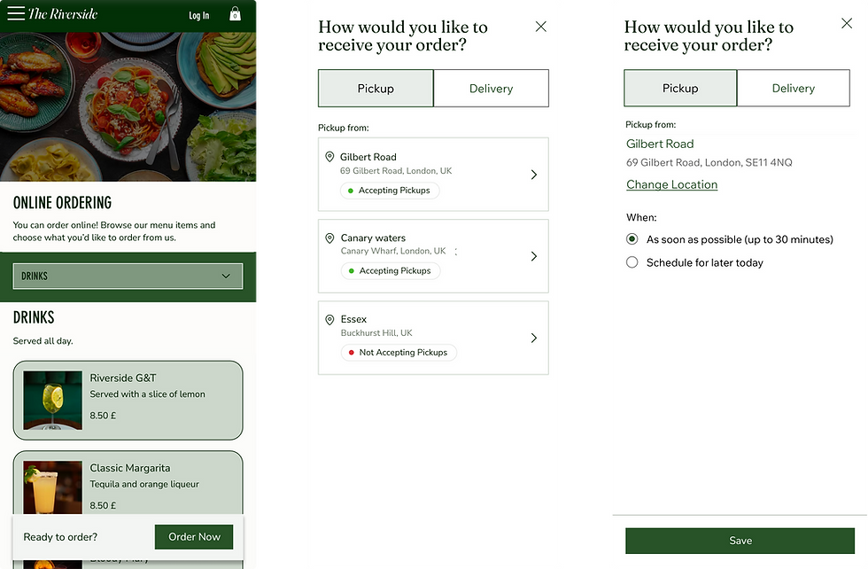
A dropdown in the old app made locations easy to miss and hard to compare. A visual lobby gives each location equal weight and visibility, helping customers make a more informed choice with one less click. This also aligned directly with a key user interview insight: no location should feel like a "main branch".
Decision 3
Making the next step clearer
Legacy app- banner

New design- sticky banner

Screens are in the palette and typography of the default Wix site palette
We made the "Order Now" banner sticky and tied it by default to the site's CTA color. It serves as a constant but non-aggressive reminder to select a location, a second entry point to the picker without getting in the way. The old app's equivalent had a 7% click rate, meaning almost nobody noticed it.
Decision 3
Clarifying oreintation
No location

Location selected

Once a location is selected, its name appears as a prominent link at the top of the page, so customers always know where they're ordering from and can switch easily.
Before a location is chosen, customers are browsing a default menu set by the business owner. They don't need to know this, and they shouldn't have to think about it. To protect customers from any confusion, we deliberately hide all fulfillment details, delivery areas, pickup times, pricing differences, until a location is confirmed. The menu is there to entice. The logistics follow once the customer is ready to commit.
Impact
After three months of releasing the feature and migrating users, we analyzed the results across multi-location sites on the new app.
66%
of multi-location users successfully migrated to the new app (goal: 90%)
13%
of app sales income from multi-location sites (goal: ~10%)
4%
of new user growth came from multi-location businesses
43%
of users who accessed the flow settings switched to the middle-ground approach instead of the menu first approach
+24%
more users clicked on the "order now" banner compared to the legacy app
Support also reported a significant drop in multi-location related support tickets, indicating that our users (both migrated and new) were genuinely happy with the new design. The 43% who switched to the middle-ground approach were the most telling signal of all: users who found the setting actively chose the approach we believed in from the start, opening a real debate about whether to make it the new default going forward.
Final designs
Menu first approach- full flow

Delivery- empty state

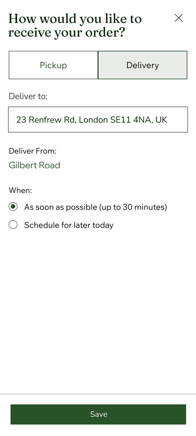
Delivery- with details
Solution
Middle ground approach full flow
Solution
Delivery method
Pickup method


