

Overview
Selecting an AI powered designer
Turning a skipped feature into a genuine design choice by simplifying the concept and splitting it to two screens.
Wix Vibe is an AI-powered conversational website builder that allows you to create professional websites simply by describing your vision. Vibe lets users choose a "Designer" before generating their site — a unique feature that gives them direct control over the general style before the AI takes over. As the sole product designer I led the UX stratergy and redesign of the feature to improve discoverability and clarity.
Role
Lead Product designer
Platforms
Desktop & mobile
Year
2025
Contributions
UX, Product, UX strategy Visual design, Image curation & creation

Problem
Low usage and skewed choice of designer
Only 12% of users clicked into the feature —and of those, 69% abandoned it before making a choice. Among users who did select a designer, the first option was chosen disproportionately more than the others, suggesting a bigger problem that users were not understanding the concept.

Designer lobby (first screen)

Designer portfolio (second screen)
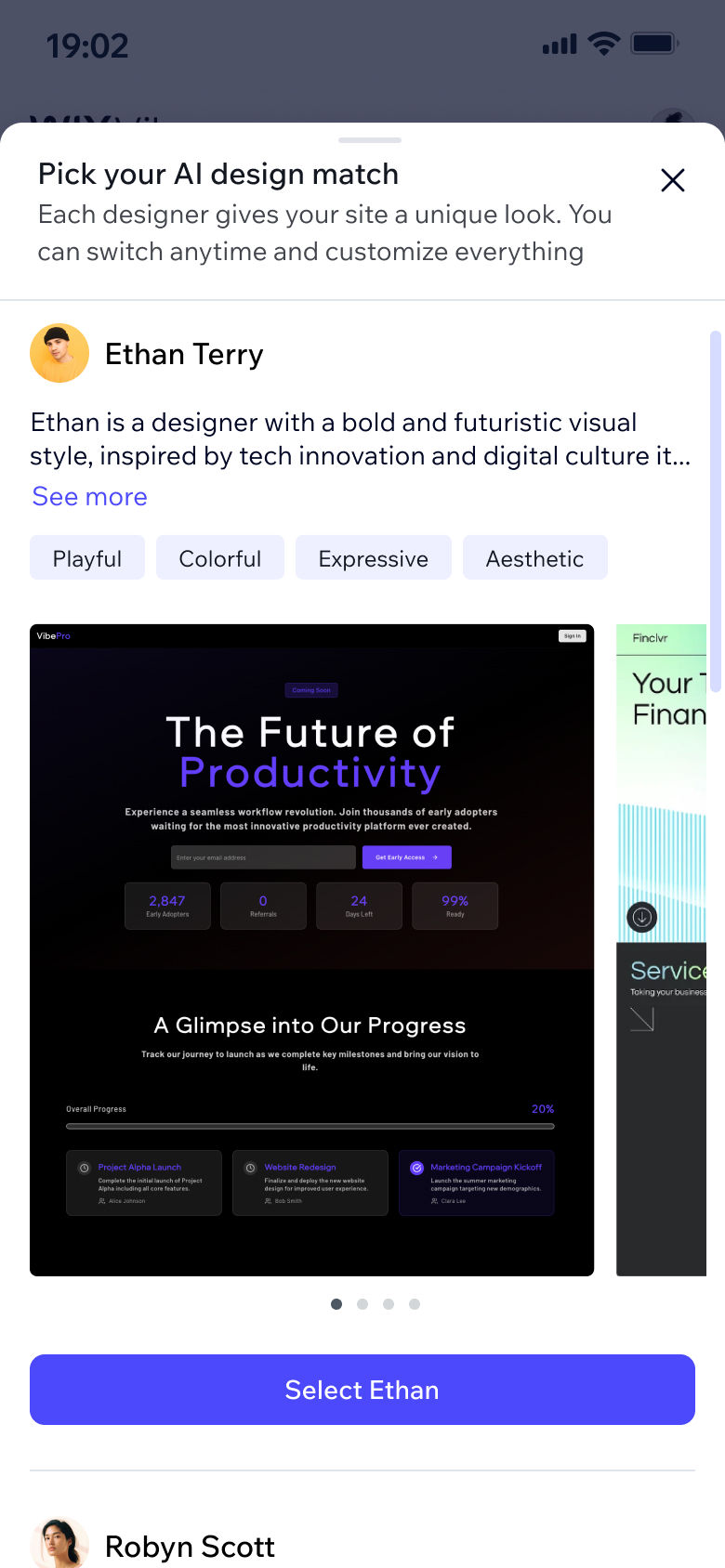
Current state

The V1 experience showed all designers side-by-side with images, names, and descriptions visible at once.
Designer lobby (first screen)
Designer portfolio (second screen)
Research
Usability testing & recorded user sessions
We held sessions with employees and users to get their first impression of the feature. The sessions showed us exactly where people were confused and often gave up — one quote in particular nailed it: "Now you're asking me to choose a template." Users weren't seeing a mood board. They were seeing a template and treating it as a commitment.
Data
The data pointed to something more specific than just low engagement: the first designer was being selected disproportionately more than the others. Users weren't making a stylistic choice — they were tapping the first option just to move past a screen they didn't understand.
Competitor analysis
At the time no direct AI competitor offered a similar feature. Looking at non-AI builders, the pattern was consistent: style selection was either tied to a fixed template or didn't exist as a standalone step. Our feature needed to work differently — users were choosing an AI aesthetic direction, not a fixed template, which meant the visual language had to communicate possibility and mood rather than a specific outcome.
Main insights
Users weren't confused about style — they were confused about what they were committing to. The images felt like promises. And when you're unsure what you're choosing, the safest move is to pick fast and move on or just give up entirely. The goal is simple, clarify the concept and boost discoverability.
Designer lobby (first screen)
Designer portfolio (second screen)
Decision 1
Simplify designer and split to two screens
Previous version
desktop

New design
desktop

The original experience asked users to evaluate five designers simultaneously, each designer included too much information; a ton of text (which no one reads anyway), multiple style tags and specific sites attributed to the designer. The redesign separates browsing from deciding. The first screen gives a quick, low-commitment overview. For users who want to go deeper, a "drill-in" option opens a designer's full portfolio of real generated sites.
Takeaways
1. Optimizing one step can quietly damage the ones that follow.
It's tempting to push for maximum engagement with any single feature. But in an onboarding funnel, every step exists in context. The real measure of success here wasn't designer selection rate — it was whether users went on to generate, publish, and upgrade. We kept that lens on every decision, including the ones that led us to drop the mandatory-step concept entirely.
2. Simpler visuals communicate more.
The more specific the imagery, the more it narrowed users' expectations — and the more confused they became. Pulling back to mood-based thumbnails gave users just enough to make a confident call without over-promising a specific output. Less really was more, and the data confirmed it.
Previous version
Designer lobby (new version)

Designer portfolio (new version)

The previous mobile version required scrolling in two directions just to see all options creating a serious usability issue. This structure respects two different personas: the ones who want to choose fast, and the ones who want to really explore — without forcing either group into the other's experience.
Full flow in context, new design
Decision 2
Lead with mood, not specifics
Previous version

New design

In V1, each designer was shown alongside specific site examples. Insights from the research showed us that users read those as templates, not style references. In V2, each designer is represented by a curated set of thumbnails that expresses a general look and feel — not a literal preview. The simpler the visual, the clearer the message.
Decision 3
Replace stock photos with AI avatars
Previous version
Robyn Scott
New Design
Pixie
The original stock photos made the designers look like real people — which felt inauthentic for a feature and platform that's entirely AI-powered. I generated custom AI avatars and worked with the UX writer to rename them with more AI-native names, so the experience is honest about what it is: you're picking a style driven by an AI agent, not a human designer.
Decision 4
Introducing a placebo: the Wildcard designer


We added a sixth option: the Wildcard. Technically, selecting it means the system picks a designer on the user's behalf. But the user doesn't experience it that way — they've made a choice, and that choice carries a sense of anticipation going into the generation. Control — even symbolic control — changes how people feel about a result.
Decision 5
Uplifting the entry point
Improving discoverability was the north star of this project — which meant the entry point needed attention too.
Previous entry point
New entry point
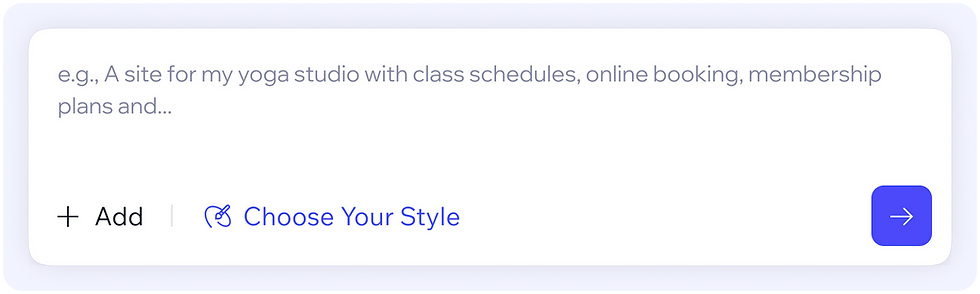
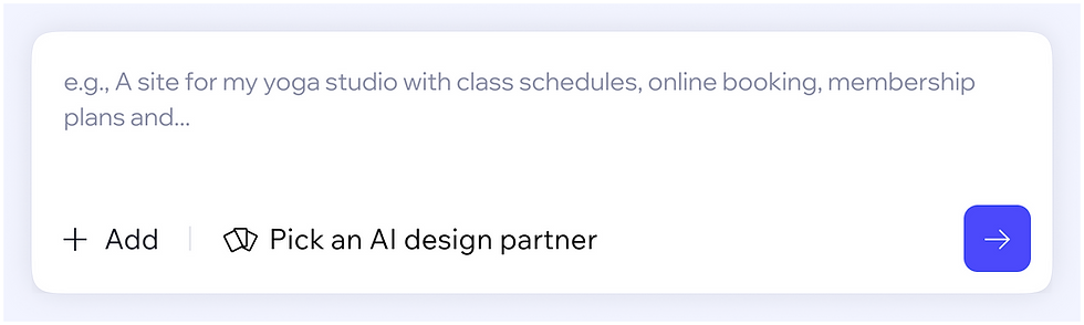
A subtle but impactful update: a new icon, revised phrasing, and improved visual hierarchy that made the feature more visible without disrupting the flow. Since designer selection is optional, it's highly prone to being skipped. We explored surfacing it as a dismissible prompt after hitting send — a last chance to choose before generation kicks off. We dropped it when we realized interrupting the flow at that moment carried too high a risk of abandonment.
Smart prompt analysis (scoped out)

We looked at using AI to auto-select a designer based on the user's prompt. The logic was sound, but getting it right would require significant development work. We scoped it out for this version and flagged it for a future iteration.
Impact
Discoverability & usage:
+16%
Users completing designer selection
+7%
Users engaging with the entry point
-18%
Drop-off rate
Designer selection distribution is more equal:
Previous version

New design

This data points to the fact that users are actually making a decision based on their style preference, not just choosing the first designer they see. The hit maps also indicated a good rate of about ~20% of users that enter the second screen (the designer portfolio screen).
The redesign did indeed move both KPIs we set out to improve.
Final designs
The redesign did indeed move both KPIs we set out to improve.
Takeaways
1. Optimizing one step can quietly damage the ones that follow.
It's tempting to push for maximum engagement with any single feature. But in an onboarding funnel, every step exists in context. The real measure of success here wasn't designer selection rate — it was whether users went on to generate, publish, and upgrade. We kept that lens on every decision, including the ones that led us to drop the mandatory-step concept entirely.
2. Simpler visuals communicate more.
The more specific the imagery, the more it narrowed users' expectations — and the more confused they became. Pulling back to mood-based thumbnails gave users just enough to make a confident call without over-promising a specific output. Less really was more, and the data confirmed it.
Mobile

Takeaways
1. Optimizing one step can quietly damage the ones that follow.
It's tempting to push for maximum engagement with any single feature. But in an onboarding funnel, every step exists in context. The real measure of success here wasn't designer selection rate — it was whether users went on to generate, publish, and upgrade. We kept that lens on every decision, including the ones that led us to drop the mandatory-step concept entirely.
2. Simpler visuals communicate more.
The more specific the imagery, the more it narrowed users' expectations — and the more confused they became. Pulling back to mood-based thumbnails gave users just enough to make a confident call without over-promising a specific output. Less really was more, and the data confirmed it.
Desktop
Dark mode


Takeaways
1. Optimizing one step can quietly damage the ones that follow.
It's tempting to push for maximum engagement with any single feature. But in an onboarding funnel, every step exists in context. The real measure of success here wasn't designer selection rate — it was whether users went on to generate, publish, and upgrade. We kept that lens on every decision, including the ones that led us to drop the mandatory-step concept entirely.
2. Simpler visuals communicate more.
The more specific the imagery, the more it narrowed users' expectations — and the more confused they became. Pulling back to mood-based thumbnails gave users just enough to make a confident call without over-promising a specific output. Less really was more, and the data confirmed it.
Other projects

Styling a menu with AI
An AI shortcut for a design process that was losing users

Beautifying AI powered websites
Wix (Vibe)

Supporting multiple locations
Wix (Restaurants)